
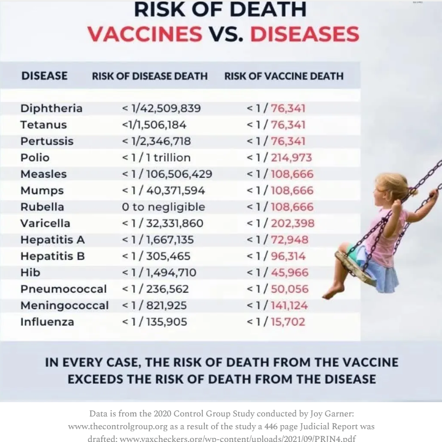
Which brings us to an incredibly important series of charts (below) that used the CDC’s own data to once again irrefutably prove what a deadly iatrogenic (depopulation) program the entire vaccine schedule really is. The last chart is indicative: Death from Common Infectious Diseases Declined 90% BEFORE vaccines were introduced. The following two images summarise study results.

The following four charts were in addition to the below study charts: